
Branding strategy, visual identity and logo design of Equestrian Academy of Emperor by Netanic
Infrastructure and site technical manager: Navid Zamani
Project manager and graphic designer: Sohail Motaghinia
Equestrian sport, as one of the most authentic, aristocratic and oldest sports, requires a visual language, branding strategy and digital infrastructure to convey the sense of glory, nobility and royalty in the best way. Netanik's strategy, creativity and development studio is proud of the 360-degree brand re-creation project, creating a luxurious visual identity and Equestrian logo design has completed the Emperor Horse Riding Academy as one of its most enduring graphic and engineering masterpieces. This project was founded with the aim of linking the glory of pure Iranian horses with the art of royal painting and raising the status of this academy to the level of an international brand. Netanik's team of experts have implemented premium B2B standards in all stages, from the creation of slime patterns to the development of the online course registration system.
Creating a unified identity that could capture the power in movement, elegance and ancient heritage of equestrianism in the form of a timeless work of art required distinct design methodologies. In the process of implementing the Emperor Academy project, Equestrian logo design It served as the main axis of identification and affected all advertising items, urban signs, official clothing and the academy's website. By combining elements of miniature painting, Iranian architectural arrays and a fully responsive website, we have created a unique platform to attract those interested in this luxury sport. This structured approach made the Emperor Academy recognized as the unrivaled leader of the equestrian industry, not only on the Mange Square, but also in the digital space. In this article, we describe in detail the branding strategies, visual identity, UI/UX architecture and technical achievements of this landmark project.
Acquaintance with the Emperor project and the requirements of Equestrian logo design
With more than 14 years of brilliant history, professional trainers and trained horses, Emperor Equestrian Academy wanted a fundamental change in registering its brand image in the minds of the premium audience. The client's main requirement was to get out of the repetitive and western graphic symbols of the equestrian field and present a luxurious, royal and rooted badge in the authentic Iranian culture. Netanik was commissioned to redesign all the brand's touch points from the main logo, color palette, printed items and urban advertisements to the online course registration website. Creating a digital platform that can recreate the feeling of being in a luxury riding complex was a top executive priority. This strategic cooperation established the foundation of a lasting transformation in Iran's elite sports industry.
Target market challenges in the equestrian industry
Equestrian sport faces challenges such as lack of visual differentiation between clubs and neglect of modern digital registrations. Most of the specialized equestrian collections are content with using simple horse silhouettes and lack a deep and original storytelling based on national heritage. In the Emperor project, our main challenge was to overcome this visual monotony and create a sign that conveys a sense of authenticity, power, security and royal splendor at the same time. In addition, encouraging the audience to register online for specialized courses required a digital infrastructure that would facilitate the process of choosing a trainer and a horse. We were able to turn these communication barriers into golden opportunities for brand growth by adopting creative visual solutions and software engineering.
The key goals of the employer in the Emperor complex
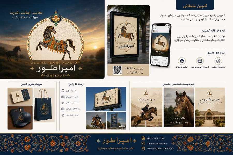
The managers of the Emperor Riding Academy had defined specific and ambitious goals to establish their position as the most equipped and classiest riding center in the country. At the top of these expectations, Equestrian logo design It was in such a way as to depict the authentic horse of Khoraman in a cover of Iranian painted saddle and armor. It was necessary to develop a comprehensive website with the ability to introduce training courses from beginner to advanced, introduce international instructors and online registration system. Also, the implementation of a 360-degree urban and digital advertising campaign with the slogan "decency, authenticity, power; Our Heritage, Your Pride' was targeted to promote brand awareness. Netanik turned all these goals into stunning outputs in the form of an agile and engineered roadmap.
“At Netanik, we didn't just portray the horse as a sporting animal; Rather, we created a masterpiece of royal painting that shows the authenticity of the neighing of the Iranian horse and the glory of the rider in every curve of the emperor's logo. - Creative Director of Netanik Studio
Market analysis and audience persona in elite sports
The research and development phase of the Emperor Academy project began with a detailed behavioral analysis of the target community and observation of the world's top equestrian clubs. The audience for equestrian sports includes families with high income levels, young people looking for excitement and dignity, and children who are looking to learn the basics under the supervision of professional trainers. Knowing the mental and aesthetic patterns of these people is the main key in formulating content strategy, website registration scenarios and Equestrian logo design was By extracting behavioral indicators, Netanik's data mining team laid the foundation for subsequent decisions in the field of color scheme, website layout and advertising tone. These in-depth analyzes ensured the complete compliance of the brand with the expectations of the target community.
Review of competitors in the riding club industry
A comprehensive analysis of equestrian references showed that most websites in this field suffer from crowded, outdated formats and lack a coherent visual identity. Lack of online booking system, failure to provide full information of coaches and lack of transparency in costs were the main reasons for the drop in applicants. Recognizing these shortcomings, Netanic introduced the Emperor to the market as a leading, quiet, transparent and extremely luxurious model. We have created a competitive advantage by providing high-quality images of manges, clear introductions to trained horses and a fast course booking system. This strategic distinction drew the attention of a large number of riding enthusiasts to Emperor Academy.
Knowing the target audience and their main needs
Emperor's audience are quality, punctual and powerful people who attach great importance to the health, safety and well-being of the academy. Parents want their children to be trained in a safe environment, with calm horses and under the supervision of trainers with international qualifications. Providing virtual tour videos of the club, introducing trainers' records and detailed timetable of classes, was a direct response to the needs of this persona. By designing an interface without unnecessary borders, we focused the user's focus on the splendor of the environment and the simplicity of the registration process. This audience-oriented approach conveys a high sense of trust and value to the applicants.
Branding and visual identity with a focus on equestrian logo design
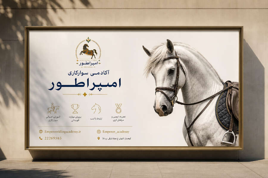
The visual identity of the emperor is a masterpiece of the combination of Iranian miniature art, arched inscriptions, painted balconies and modern royal graphics. All visual elements, from the logo to tiling patterns, office set, riding hat, printed bags and urban billboards, are created based on a precise geometric system. This visual integration makes the buyer experience the feeling of being in a royal academy at every point of contact. In the project implementation process, Equestrian logo design As the main focus of this identity, it directed all visual items. By writing the comprehensive Brand Book, Netanic developed a standard policy to maintain this beauty in the future.
Logo design and visual concept of Emperor Academy
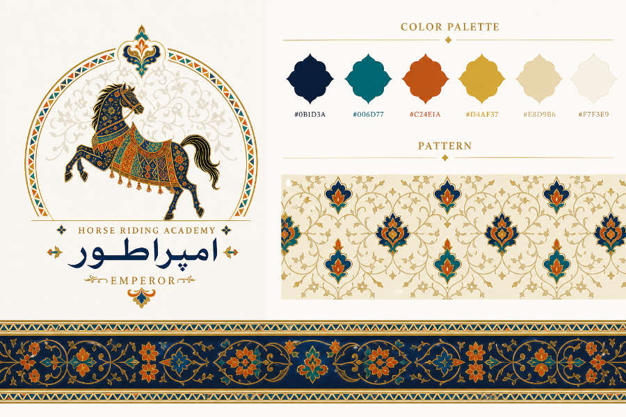
The emperor's logo is a unique and understandable combination of the shape of the Iranian Khoraman horse, the saddle cover and the miniature gold-embroidered armor and the arch of royal inscriptions. The horse in this logo is depicted with a raised posture, braided tail and powerful steps, which is a symbol of power in movement, nobility and originality. The upper arch of the logo with solar arrays and Iranian stucco balconies instills a sense of sobriety and protection of the kingdom. Persian typography "Emperator" and English "EMPEROR" with long, balanced and dignified lines, has created a wonderful harmony with the geometric form of the symbol. this Equestrian logo design It shines beautifully on packaging, apparel and website.
Psychology of exclusive colors and patterns
The selection of the emperor's color palette is based on the psychology of royal colors and creating a sense of dignity, power, authenticity, excitement and value. A combination of dark navy blue (#0B1D3A) as a symbol of authenticity and Persian turquoise (#006D77) conveys a sense of tranquility and Iranian heritage. The colors of brick, shimmering gold (#D4AF37), royal cream and muted white create a unique contrast and sense of opulence and grandeur. In addition to the color palette, a special painting pattern including Khatay and slime flowers was designed for use in borders, fabrics and backgrounds. The table below describes the technical details and psychological analysis of the main colors of the Emperor brand.
color name | Color code (HEX) | Role in UI/UX and branding | Psychological message in branding |
|---|---|---|---|
Dark navy blue | #0B1D3A | Logo frame, site header, fonts and powerful elements | Instilling the highest level of authenticity, stability, strength and dignity |
Persian turquoise | #006D77 | Iranian arrays, icons, borders and symbols | A sense of peace, the authenticity of Iranian art, health and trust |
Royal Bricklayer | #C24E1A | Saddle and harness, special accents and buttons | A symbol of energy, riding excitement, warmth and originality of soil |
Shiny gold | #D4AF37 | Original logo, premium badges and luxurious elements | A symbol of royal quality, preciousness, glory and wealth |
light cream | #E8D9B6 | Background cards, sections and visual breathing space | Inducing softness, simplicity, intimacy and visual purity |
Interface design and user experience (UI/UX) on the Emperor site
The UI/UX design of the Emperor Academy website was done with the aim of providing a fluid, attractive and completely luxurious experience for equestrian sports enthusiasts. The visual structure of the site is arranged in such a way that the user can fully feel the luxurious and professional atmosphere of the academy upon entering it. The use of slime patterns in the margins and standard Persian fonts has given double beauty to the pages. The introduction cards of the courses have made the choice very simple for the user by separating the beginner, intermediate, advanced and children levels. on all pages Equestrian logo design It is placed in the fixed header so that the brand identity is always evoked in the audience's mind.
Home page design and course introduction structure
The main page of the Emperor's website has been designed with a focus on introducing the academy's services and showing the management environment. The main banner (Hero Banner) welcomes the user with a graphic image of the Emperor logo and the slogan "Where skill, confidence and love of the horse grow together". Embedding quick access buttons to "Course Registration" and "View Courses" in the center of the page has shortened the user's action path. The "About Academy" section contains key statistics such as 14 years of experience, 8 professional trainers, 25 trained horses and 3,000 active students. This transparent information architecture has made the trust process and online registration a pleasant experience.
Mobile user experience and touch optimization
Considering that more than seventy-five percent of users check sports websites through smartphones, the mobile version of Emperor was optimized with high accuracy. All the touch elements are designed according to the ergonomic standards of the human hand so that it is possible to register in the courses with one thumb. The bottom floating menu provides instant access to courses, virtual tour, contact and mange booking. High loading speed in the mobile network prevents the applicant from canceling during registration. This seamless mobile experience has dramatically increased the number of online registrations for Emperor Academy.
Technical development and dedicated infrastructure on the Emperor platform
Netanik's software engineering team has built the Emperor website on a foundation of highly optimized, scalable, and secure code. The exclusive online registration system is designed in such a way as to prevent the interference of training hours in the classrooms and overfilling the capacity of the classes. The developed content management system allows administrators to easily upload training videos and video reports of events. The developed infrastructure has the ability to manage heavy traffic during advertising campaigns. This advanced engineering has ensured the complete stability of the Emperor Academy's digital platform around the clock.
Technical architecture and loading speed
Page loading speed has a direct impact on user satisfaction and search engine rankings, especially for a site with high-quality graphics and banners. By applying modern techniques of image compression to WebP format, we have reduced the loading time to under 1.5 seconds. The front-end and back-end codes are completely clean and developed according to international programming standards. The use of advanced caching systems minimizes the load on the server during peak registration periods. This premium technical performance has brought user satisfaction and improved Google PageSpeed indexes for Emperor.
Security and payment gateways on the Emperor site
Protecting students' personal information and creating a safe platform for paying course fees has been Netanik's main priority in developing the Emperor site. Institutional SSL certificate deployment and powerful firewalls provide a secure environment for online registration and payments. Connecting to direct bank payment gateways with intelligent navigation has reduced the rate of failed purchases to zero. All user data and registration records are stored on isolated and encrypted servers. This security infrastructure has made the imagination of students and parents completely comfortable in carrying out financial transactions.
Deploying the DDoS anti-attack system to maintain the full stability of the website during urban advertising campaigns.
Two-way encryption of all student and tuition data based on valid security protocols.
Direct connection of the registration system to the SMS panel to automatically send class confirmation and entry card.
The ability to pay online course fees and the possibility of smart installments for advanced students.
Real-time synchronization of mange capacity and training programs with the trainers' management panel.
Providing an official digital invoice containing a QR code for tracking and authentication when entering the academy.
SEO strategy and keyword research in the Emperor project
The SEO strategy in the Emperor project was developed with the aim of conquering the first ranks of Google in the words related to riding training and riding clubs. Netanik's SEO team established the site's content structure and course landing pages by carefully researching keywords. Focusing on local keywords (Local SEO) optimized the possibility of attracting premium audiences in the surrounding areas. Also, in all structured codes, Equestrian logo design and the Emperor brand were introduced to Google robots. This data-driven approach has exponentially improved organic site traffic and online sign-ups.
Keyword research table for Emperor
Accurately identifying the most searched keywords in the equestrian industry paved the way to drive organic traffic to the Emperor website. We segmented keywords based on user intent into general, educational, branding, and online registration groups. Focus on specialized phrases like Equestrian logo design In Netanik portfolio section, it was planned to attract similar B2B projects. The following table shows a part of the compiled keyword strategy, search volume and user intent in the Emperor project.
Main keyword | User Intent (Search Intent) | Relative search volume | Target landing page on the site |
|---|---|---|---|
Equestrian logo design | Commercial / B2B (design order) | up | Netanic's portfolio page / Emperor's article |
Beginner and professional horse riding training | Educational / commercial | very high | Main page of training courses |
The best riding club | Commercial / local (collection discovery) | up | Page about Emperor Academy |
Children's riding class registration | Transactional (online registration) | average | Dedicated page for children's course |
Cost of riding class and rental of mange | Informational / commercial | up | Table of tariffs and tuition fees |
Technical implementation of SEO and local SEO (Local SEO)
Implementation of structured markup (Schema Markup) specialized SportsActivityLocation, transmits address information, coaches, working hours and courses to Google. Accurately listing Emperor Academy on Google Maps and internal maps has skyrocketed local SEO entries. The intelligent internal linking structure transfers the authority of the blog pages to the online course registration system. Optimizing images of mange and horses with alt-texts containing keywords strengthened the site's ranking in Google image search. These comprehensive technical measures have made the SEO infrastructure of Emperor absolutely unbeatable.
Achievements and key results of the Emperor branding project
The implementation of the 360 degree Emperor project by Netanik brought amazing results in all key performance indicators. Unveiling the new visual identity and Equestrian logo design The emperor attracted the unique welcome of the equestrian community and sports activists. The implementation of environmental and digital advertising campaigns with the slogan "decency, authenticity, power" quickly completed the capacity of training courses. The launch of the high-speed digital platform has greatly improved the share of online registrations. In the following, we review some of the registered growth indicators of this successful project.
Growth indicators and conversion rate improvement
The statistics show a tremendous jump in brand awareness and online registrations of Emperor Academy after the implementation of the project. The attractive UI/UX design and simple registration process dramatically improved the conversion rate of visitors to definitive students. The success of fancy advertising items and urban billboards has brought back students in advanced courses. These tangible digital achievements are a testimony to the power of combining Netanik's branding strategy and precise software engineering. The following list shows some of the numerical successes of the Emperor project in a six-month period.
420% growth in organic website traffic through Google search engine.
Registration of more than 1500 successful online registrations in various training courses of the academy.
Getting top Google rankings in highly competitive keywords in the field of education and riding club.
70% reduction of in-person referrals for initial registration due to the digital system.
50% increase in demand for riding training courses for children and teenagers.
Obtaining 99% satisfaction of students and parents about the beauty of visual identity, clothes and Equestrian logo design.
Support services and future development plans
Netanik Studio is committed to continue its strategic partnership with Emperor Equestrian Academy to maintain its leading position. Our support team monitors the performance of infrastructure, registration system and site security 24 hours a day. In future development phases, the addition of an online riding equipment store and an online boarding system for horses is expected. Also, planning to hold national competitions with a unified visual identity of the emperor is on the agenda. This continuous partnership guarantees the stability and constant growth of the Emperor brand in the luxury sports industry.
Providing technical support services, security monitoring and site code updates on an ongoing basis.
Continuous analysis of user behavior on the website to continuously optimize the conversion rate and registration system.
Provide periodic analytical reports of SEO status, organic entries and registration rates.
Development of horse boarding management module and viewing of daily health reports by owners.
Planning for the implementation of campaigns for the new season with the design of clothing and printed items.
Frequently asked questions about equestrian logo design and branding
Launching and re-creating the brand of a riding academy requires a clear response to the visual, technical and marketing concerns of the owners of this industry. Knowing the stages of logo design, developing a visual identity, and website requirements will help employers make better decisions. Netanik's senior experts are ready to answer all your doubts in the way of building an elite brand. In this section, three common questions about branding and Equestrian logo design We have answered. These answers will give you a comprehensive view of Netanik's professional methodology.
What is the importance of riding logo design in attracting premium audiences?
The logo is the first visual symbol that conveys the caliber, credibility and quality level of an academy's service to premium buyers. one Equestrian logo design Luxurious and original, it instills a sense of decency, security, power and sports glory without the need for words. A logo created on the basis of rooted artistic elements and modern geometry ensures the distinctiveness of your academy. This visual permanence greatly increases the likelihood that your collection will be chosen by families and professional athletes alike. In addition, a strong logo forms the foundation of all your caps, apparel, billboards, and competition medals.
What are the stages of developing a 360-degree visual identity for an equestrian club?
Developing a comprehensive visual identity begins with a careful review of the academy's values, the level of management facilities, and the persona of the target audience. In the next step, the main concept of the brand is extracted Equestrian logo design It is done with a color palette and exclusive typography. Then painting patterns, riders' clothes, mange, office sets and printed items are designed according to the logo. Finally, all these elements are documented in the form of the Brand Book and implemented in the website and advertisements. Netanik implements all these steps with engineering obsession and quality at the international level.
How much is the cost and time required to implement the complete branding and website project?
The cost and timing of the project implementation depends on the extent of services, the variety of printed items, the complexity of the registration system and the level of branding. In Netanik Studio, projects are priced after holding requirements analysis sessions and drafting transparent proposals. Comprehensive projects similar to the emperor that include Equestrian logo design, visual identity, 360 degree campaign and dedicated website, usually need between 2 to 3 months. All phases proceed according to a precise schedule and agile methodology. This transparency in implementation will guarantee the delivery of a perfect project and according to the set budget.
Call to Action (CTA) - Exclusive consultation with Netanik Studio
Creating a strong, luxurious and lasting sports brand requires cooperation with a team that has art, strategy and technology together. Netanik's strategy, creativity and development studio is with you with a brilliant track record in designing visual identity and developing digital platforms. We are committed to increasing the value of your brand in the market by providing exclusive and data-driven solutions. If you are planning to turn your riding academy or collection into an important, royal and popular brand, get in touch with us today. Let us create a platform together that best portrays the original glory of your brand.
Why Netanik is the best choice for the visual identity of your riding academy?
Netanic is not just a graphic artist, but a specialized studio for identity creation, brand storytelling and business transformation. Our multidimensional look at Equestrian logo design, luxurious painting, dedicated UI/UX and advanced SEO, gives a distinct advantage to the projects. We obsessively implement all visual and technical details in accordance with international B2B standards. Our dedicated support and data-driven approach will ensure your high rate of return on investment (ROI). Choosing Netanic is a long and sure step towards market leadership and building a lasting brand in the premium sports industry.
Start building your royal brand right now
If you are ready to turn your riding academy into a prestigious and luxurious authority in the country, don't waste time. Netanik's strategic consulting department is eagerly ready to review goals, analyze challenges and provide operational solutions for your collection. You can set up your private meeting with our experts through the consultation request form on the website or direct contact. In this meeting, we have a dedicated branding roadmap. Equestrian logo design And we will map the digital development of your business. Contact Netanik to create a bright and best-selling future for your brand together.